Hey, I'm Chris 👋
Product Design Strategy Growth
I'm a product and design leader who blends product leadership, strategic thinking, and design principles to help early-stage founders find clarity, gain traction, and drive business growth.

I'm currently leading product design and bringing a new product to market at The Gap.
Big on finding opportunities, solving problems, developing strategy, team leadership, asking hard questions, thoughtful design, product-led growth, workshop facilitation, product thinking, reading, writing, surfing...
...always curious, always learning, always exploring!
You might hire me for...
Product strategy
Developing successful products using customer insights to prioritise problems to solve, validate ideas, develop an effective roadmap.
Product leadership
Leading cross-functionally to discover, design, & develop new products by turning fuzzy ideas into a clear vision and launching to market.
Product design
Creating simple & intuitive user experiences from early stage discovery through to high-fidelity designs ready for development.
Product activation
Driving user activation by turning curious leads into paid users using product-led growth strategies.
Driven by purpose, I'm most proud of work that solves real needs and makes an impact for both the business and the customers they serve.
0 → 1 Health Tech B2B SaaS
Case Study: From Idea to Product-Market Fit Through User-Centric PLG
How strategic, user-centered design helped a struggling early-stage product navigate ambiguity and drive 100x growth in business revenue.
AI B2B SaaS
Case Study: Unlocking New Value Streams Through AI-Powered Insights
Designing an AI-powered business advisory platform to create new value streams & unlock client potential.
I believe that play is an important part of work.
These are projects/experiments I've done on my own to learn something new or follow a curiosity.
Experiment Content Community Growth
Case Study: From Curiosity to Community Through Content Creation
How curiosity, creative content, and consistency led to 20x organic growth in a sea of noise.
"Chris has a unique ability to see both the forest and the trees. He can zoom out to understand the strategic picture while also diving into the details that make experiences naturally intuitive."– Anonymous (Founder)
0 → 1 Health tech B2B
Case Study: From Idea to Product-Market Fit
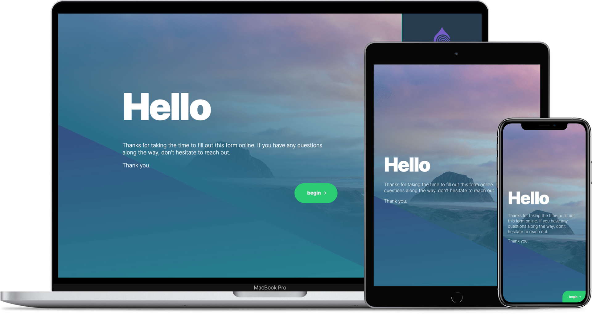
When I joined Finger-Ink as their first hire, the company was struggling with a classic early-stage problem: they had built a solution in search of a problem.Our generic digital forms iPad app could theoretically serve any industry, but in practice, it was serving virtually no one. With only a handful of customers and stagnant growth, we were burning through runway with no clear path to sustainability.The numbers told a sobering story: only $100 monthly recurring revenue and just a handful of customers.We needed a fundamental shift in our approach, fast.
My role
Research, Design, Prototyping, Onboarding
Team
2 Full-Stack Product Designers, 2 Co-founders
Outcome
Achieved PMF through design-led product development
Impact
Grew from $0 -> $10k MRR
Finding Signal in the Noise
Rather than building features in the dark, we turned to customer research to learn. We engaged everyone we could in interviews and asked curious, open-ended questions to understand not just what they were doing with our product, but why they had chosen it in the first place.The breakthrough came when we identified a clear pattern: over 80% of our active users were healthcare professionals all struggling with the same core problem.They were drowning in paper-based patient intake processes that were time-consuming, error-prone, and created friction in their daily operations.This wasn't just a nice-to-have solution; it was solving a real pain point that affected their bottom line and patient experience every single day. So we decided to double down on what was working.Some ways we did this included:
Designed industry-specific templates that enabled customers to pick up and go.
Researched our customers and the broader market to better understand their workflow and the wider ecosystem they operated in.
Designed an in-app onboarding experience as a way to learn from anyone who signed up.
Our target market was becoming clearer as was our value proposition, but there was still some fuzziness to clear up…
Turning Insight Into Integration
While customer acquisition was improving, it was still a slog and we knew we could do better.Through continued user research—including on-site visits and extensive customer interviews—we uncovered a critical flaw in their workflow: our customers were exporting forms from our app and manually re-entering it into their practice management system, Cliniko.💡 Cue lightbulb moment.We dug deeper and investigated all things Cliniko, especially how our customers were using it.After researching Cliniko's market presence, we discovered they had significant customer bases across Australia, the UK, New Zealand, and Canada—all the markets we were already exploring.We also learned that our customers loved Cliniko, so were unlikely to jump ship anytime soon.
The Strategy: Pivot Towards a Practice Management System
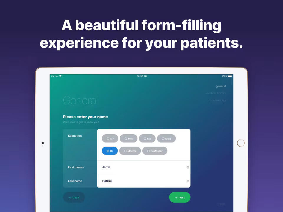
Armed with this insight, we made a strategic pivot to focus exclusively on Allied Health Professionals who use Cliniko as their practice management system.This meant making a bold bet: abandoning the broader market (including some of our existing customers) to serve a specific niche and doing it exceptionally well.The product strategy became a direct integration with Cliniko and embedding ourselves in the workflow of Allied Health Professionals.This pivot also made it crystal clear for us, from our market to our messaging to our value proposition.
Product-Led, User-Centric Product Development
I played a key role in designing this integration from concept to launch, balancing user needs with technical constraints, as well as forming a working relationship with the team at Cliniko.Some of the key things we did to execute this pivot:
User Research & Strategy: Conducted interviews & flow mapping sessions with customers to understand their current workflow pain points.
UX Design: Created detailed wireframes and prototypes showing how data would flow seamlessly between platforms & the steps a user would need to take to get there, testing multiple approaches with users.
Usability Testing: Ran moderated testing sessions with beta customers throughout development, iterating on the design based on real usage patterns.
Web design: Redesigned our website and updated the copy to speak directly to our target audience.
Onboarding Experience: Redesigned our onboarding experience to reduce time-to-value (TTV) and get to the first “ah ha” moment as quickly as possible.
Partnerships: Formed a working relationship with the Cliniko team to design our app so it fit well within the Cliniko ecosystem.
Transformational Growth (100x)
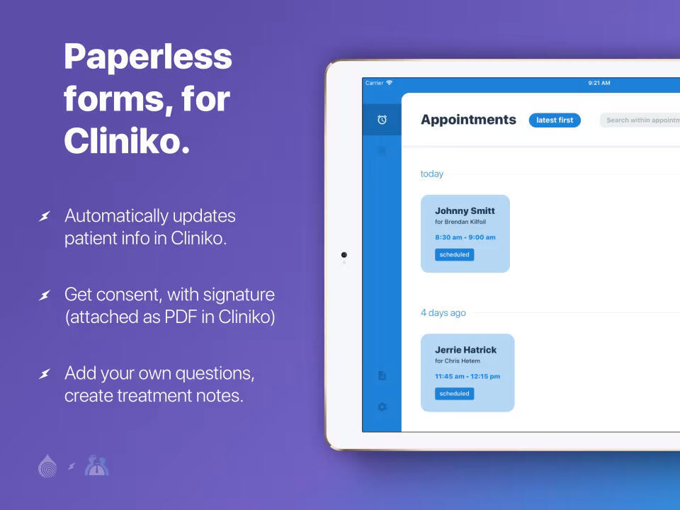
The results of these strategic product & design changes was really impactful. Our customer acquisition rate increased by 300% as we finally had a clear target market, a clear value proposition, and an intuitive user experience that supported it based on real user insights.The Cliniko integration didn't just improve our product—it transformed our entire business trajectory:
Revenue grew by a 100x increase (from $100 to $10,000 MRR)
Customer satisfaction scores improved significantly as we eliminated a major workflow friction
Market reach expanded into new geographic territories through Cliniko's customer base
Customer retention increased as our product became more deeply embedded in their daily workflows
New product opportunities emerged as we carried on with our continuous discovery efforts.
But the quantitative metrics only tell part of the story. Our customers were genuinely thrilled with the time savings and improved patient experience. Many reported that their patients loved the streamlined check-in process, creating a positive feedback loop that drove word-of-mouth growth.
Designing for Edge Cases and Future Needs
Success with the integration opened our eyes to even greater design challenges. Through ongoing user research, we identified that many of our customers were reception-less sole practitioners, but were often with another patient already when someone else walked through the doors.This made for an awkward experience for both patients & the health practitioner, creating a new UX challenge for us to solve around self-serve patient check-in.To help design a self-serve check-in solution, we:
Conducted contextual inquiries in actual clinic environments to understand spatial constraints and patient behavior (distant customers would send us photos of their space)
Created flow maps for both scheduled and walk-in patients
Created detailed interaction showing micro-animations and transitions that would guide users naturally through the process
The final design solution featured an intuitive decision tree that branched users into "I have an appointment" or "I don't have an appointment" paths, with clear visual cues and progress indicators throughout. This seemingly simple design decision made for an easy, intuitive experience for patients arriving.
Establishing a Design Practice for Product-Led Growth
Throughout this journey, I helped establish a design practice for product development that became the foundation for sustainable growth:User-Centered Design Process: I implemented systematic design research methods—contextual inquiries, usability testing, and analytics analysis—making user insights the foundation of every design decisionCross-Functional: I worked closely with the founders and development team to ensure designs were feasible without sacrificing quality.Rapid Prototyping Framework: I established low-fi to high-fi prototyping workflows that allowed us to test concepts with customers before committing engineering resourcesBusiness-Focused Design Metrics: I connected design decisions to business outcomes using event-based analytics to track and measure our work.
A Solid Foundation to Continue Growing
By the time I completed this role, Finger-Ink had been transformed from a struggling generic tool into a focused, growing SaaS business with clear product-market fit. More importantly, we had built sustainable systems for continued growth:
Strong customer research capabilities that could identify new opportunities
Efficient product development processes that balanced speed with quality
Scalable integration architecture that allowed easy integration with other practice management systems
Strategic partnerships that opened new distribution channels
A loyal customer base that actively promoted our solution
This experience completely opened my eyes to the power of being a user-centered full-stack product designer –– it's about deeply understanding customer problems, translating insights into strategic product decisions, and crafting experiences that drive measurable business impact.The journey from $100 to $10K MRR in a bootstrapped environment required every skill in the design toolkit: user research, product thinking, information architecture, interaction design, visual design, prototyping, and design strategy.Most importantly, it demonstrated how design thinking can be the driving force behind product-market fit and sustainable business growth.
Experiment Content Community Growth
Case Study: From Curiosity to Community Through Content Creation

My role
Research, Content Strategy, Content Creation, Product Development
Team
1 Content Creator
Outcome
A validated market, 20k engaged audience, paid product (sold out)
Impact
22x audience growth
13% average engagement rate (above industry average)
Where Curiosity Meets the Sea
While surfing with friends and observing others in the lineup, I couldn’t help but notice a consistent pattern: intermediate surfers were struggling to get the hang of things and progress their surfing beyond the beginner basics.Naturally curious, I decided to let my curiosity take the lead and find out more.I spoke with 10 or so different people to learn more about their journey, what they were struggling with, and understand why they weren’t progressing.I learned that ~90% of them just didn’t have any sort of structured learning beyond those first lessons where you (barely) learn the basics.So I went searching to see what might be available – online courses, YouTube channels, surf schools, coaches…While there were a few options, they were certainly limited & most of them were targeted towards total beginners or more advanced surfers – not the everyday surfer just looking to improve enough to have a good time. It was also primarily shortboarding advice, not longboarding, which was growing in popularity at the time.A hypothesis started to form…There's an underserved market segment between beginner surf lessons and professional coaching and creating something specifically for longboarders in this space would resonate with people and gain some traction.
Creating Content as a Validation Strategy
Rather than diving into a digital product, I chose to test the waters using content as a validation strategy for a few reasons:
Lower barrier to entry with existing 1K follower base on Instagram within the surf industry
Real-time feedback loops to validate assumptions before heavy investment
Audience building creates distribution advantage for future products
Content doubles as product research - each post tests a micro-hypothesis about user needs
Developing a Content Strategy & Experimenting Along the Way
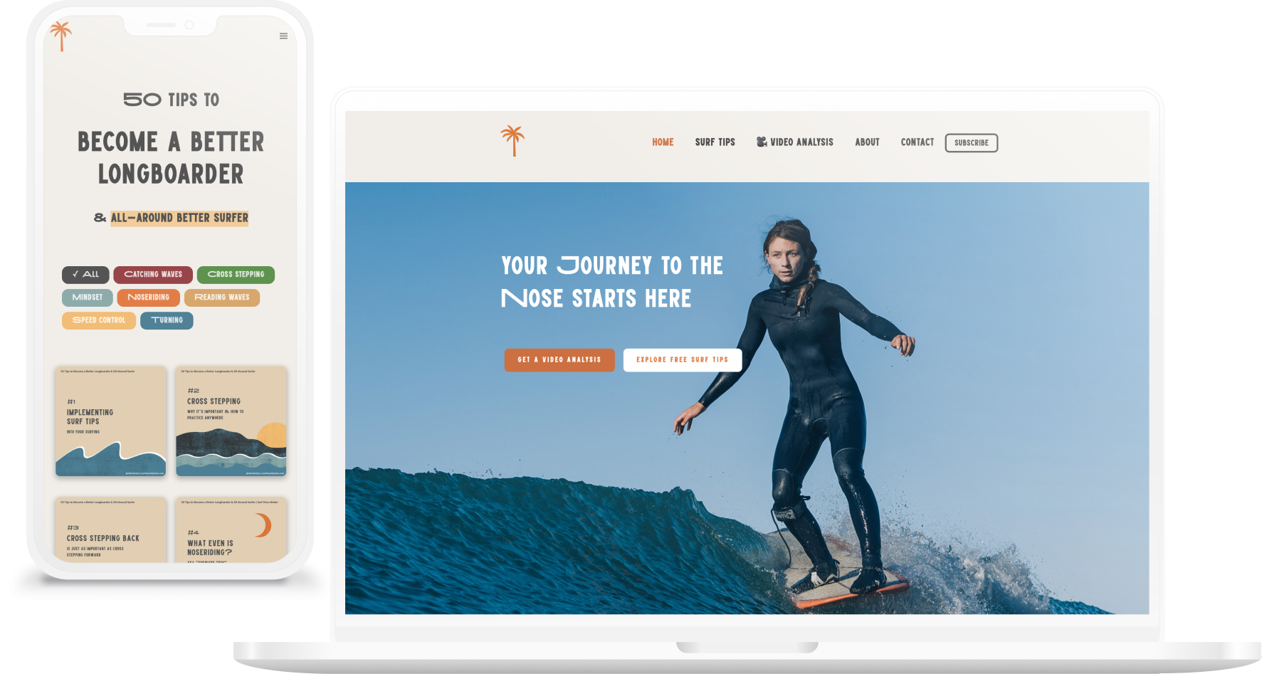
When it came to running this experiment, I decided to commit to an entire year to test consistency as a growth lever as well as give myself a personal challenge.Committing to a year also gave me sufficient time to explore different things under the same umbrella, such as different formats (reals vs carousels vs images), different topics, or even monetization methods.I chose Instagram as my primary channel to leverage my existing following while also cross-posting to a blog and newsletter for farther reach.Instagram also had a built-in forcing function with length limits on posted content, so this helped me focus on the bite-sized, actionable tips I was aiming for.
Noticing the Signals
It was fairly obvious early on that I was striking a chord with the wider surf community and filling a much needed gap. There was both quantitative and qualitative indicators, such as:
Engagement 3x industry average suggested content resonated deeply
Organic revenue generation proved willingness to pay (through Buy Me a Coffee)
High survey participation (1000+ responses) indicated an engaged community
Consistent growth trajectory throughout 12-month period
Regular DMs requesting personalized advice
Community members sharing their own progress stories
Requests for more advanced content and structured programs
Questions about one-on-one coaching availability
My Own “Ah ha” Moment from Unexpected Research Results
Although I had some ideas on where I could take things, I didn't want to rely on what I thought people wanted, especially when I had a growing & active community at my fingertips. So I surveyed 1,000+ community members to better understand their pain points and collect further insights.One of the biggest aha moments for me from the results?Fear was mentioned by ~67% of respondents as one of the primary things holding them back – which wasn't something I expected as this isn't something I particularly struggle with when it comes to surfing.This completely reframed my understanding of the market. I had been focused on the technical "how-to" aspects of surfing, but the real barrier for most people was psychological. They didn’t just need to learn how; they were afraid to try it.So while I was posting mostly practical tips on technique, it was clear that, while helpful, there was another barrier that needed to be overcome. Which is what led to the next development…
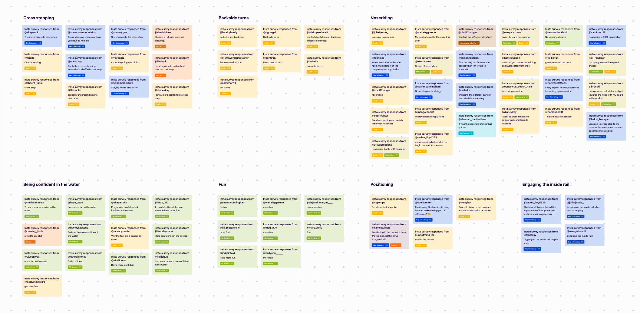
Turning Insights Into a Digital Product
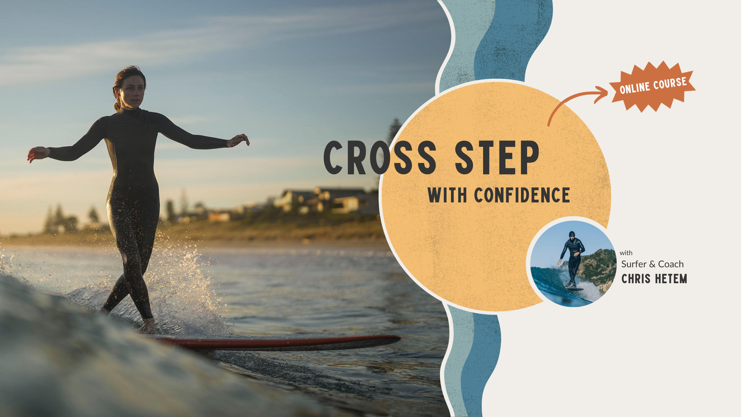
An online course called “Cross Step with Confidence” that includes structured learning on the techniques of cross stepping with confidence-building tidbits woven into each lesson.I ran this as a cohort-based course with 25 students at $47 per person and sold out within the first 3 days of launch.The course combined technical instruction with mindset work, addressing both the skill gap and the confidence barrier that my research had revealed.Results were encouraging with an overall positive response from students and a newfound stoke (confidence) to practice what they learned.I even had a few students email me months later saying they revisit the course again and again and always get something new out of it.
Lessons & Learnings
As with anything I do, I always love to reflect and identify what I learned. Some of the key lessons from this project include:
Content-first go-to-market can effectively validate demand before product development
Consistency beats perfection for building audience trust and engagement
Underserved niches often exist between obvious market segments
Community feedback is more valuable than assumptions for informed decision-making
About Chris (that's me 😛)
👋 I'm Chris – a full-stack product designer with 10+ years experience designing & building digital experiences.By connecting strategy with product design, I discover, define, & design human-centered products that deliver business impact.Taking a holistic approach to my work, I'm just as comfortable zooming in on the details as I am zooming out to see the big picture.
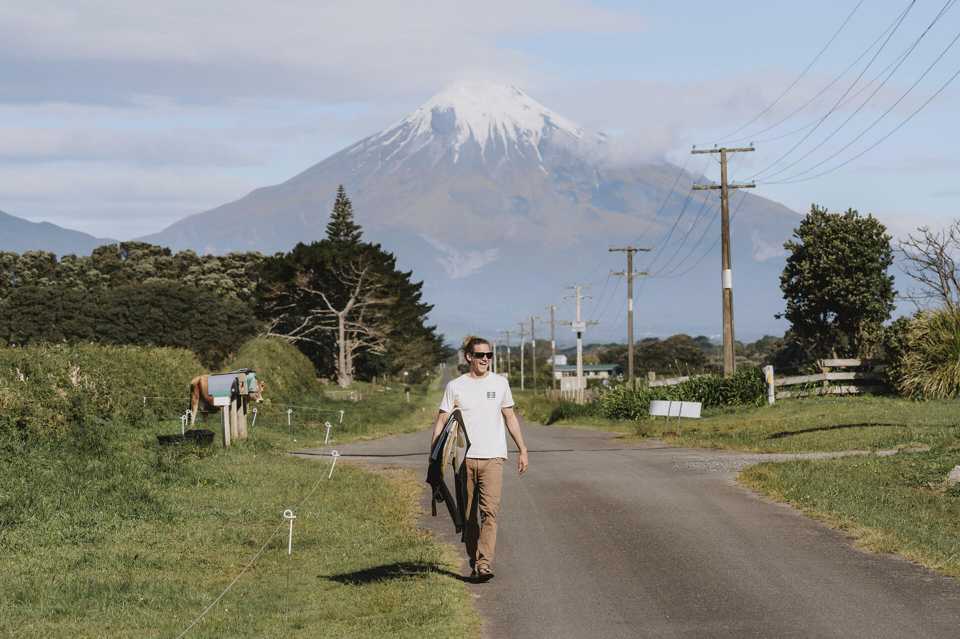
Driven by my curiosity and desire to make a positive impact on the world, I love solving new and challenging problems that make a real difference.I believe you can never ask too many questions, no ideas are silly, and that play is an important part of work.
"Working with Chris has been fabulous and he's a real pro at making the impossible possible!"– Diane, Founder of My Nectar Health
Interests
Outside of work, I enjoy spending time outdoors, reading & writing, cooking, hiking, camping, traveling, learning new things, and experimenting with new ideas and various side projects.Surfing is my main hobby and has brought me to some pretty amazing places such as Costa Rica, Panama, America, Australia, and New Zealand where I now live.
Now
I’m currently leading design and bringing a new business advisory platform to market at The Gap as part of a cross-functional product team.
Open to opportunities?
Yes, I’m open to remote opportunities with valid working rights in the United States, New Zealand, and Australia – get in touch!